Using Control Windows
With the exception of the Image Window, windows listed in the View menu are referred to as control windows.
This section describes the functions common to the control windows and how to use them.

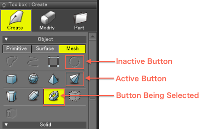
- Available Buttons
- Clicking an available button will select that tool or function.
- Selected Buttons
- Buttons that are currently selected will be displayed with a yellow background.
- Unavailable Buttons
- Unavailable buttons are dimmed and cannot be selected.
Note The available/unavailable status of a button depends on the conditions required for its use.

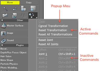
- Pop-up Menus
- A pop-up menu is a kind of submenu. Clicking a tool icon with a small triangle in the lower right corner will display a pop-up menu from which you can select several options.
- Available Commands
- Available commands are not dimmed and can be selected.
- Unavailable Commands
- Unavailable commands are dimmed and cannot be selected.
Note The available/unavailable status of a command depends on the conditions required for its use.

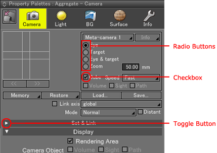
- Radio Buttons
- An item is selected when the circle is marked in black (this status is described as "on" or "selected"). Only one radio button can be selected within a group. Selecting another item will cancel the previously selected item.
- Checkboxes
- If a checkmark appears next to an item, it is selected (enabled). If there is no checkmark next to an item, it is not selected (not enabled).
- Show/Hide Buttons
- Many control windows are divided into "groups" of tools or parameters. These groups can be collapsed (hiding the enclosed options) by clicking on the small triangle at the far left of the group's name. Click on the show/hide button (the triangle) again to expand the group.

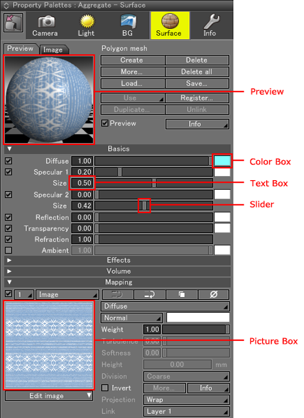
- Preview
- This shows a preview image of the current settings.
- Color Box
- This box displays the color that is set. A color can be set using a drag & drop operation from another color box, using the Color Window, or using the standard color picker for your operating system. Clicking a color box will open the OS's standard color picker.
- Text Boxes
- This box displays the numeric value that is set. Clicking a text box will highlight it in yellow and allow you to enter a numeric value from the keyboard. In some cases, a value that exceeds the range of the slider may be valid. Moving between text boxes in a control window can be done using the Tab key on the keyboard. Use Shift + Tab to move backwards.
- Sliders
- Drag the slider to set a value. A dialog for entering a numeric value appears when you click the slider while holding down the Ctrl key (Win)/Option key (Mac).
In a numerical input dialog, a value that exceeds the slider limits or exceeds the maximum number of displayable digits in the value box may still be valid. "#####" will be displayed in the value box if a value that exceeds the maximum number of displayable digits is entered.The radius of the disk 
- Image Boxes
- An image box can be found in the Surface Window, Background Window, and other places. It displays the loaded image. Clicking the Edit Image button below the image box will open a pop-up menu. Select Load... from the pop-up menu to select an image to load. The pop-up menu can also be displayed by right-clicking the picture box (Win) or by clicking the picture box while holding down the Control key (Mac). In addition to loading an image, image operations such as Copy, Paste, Save... and Edit Image... are available from this pop-up menu.